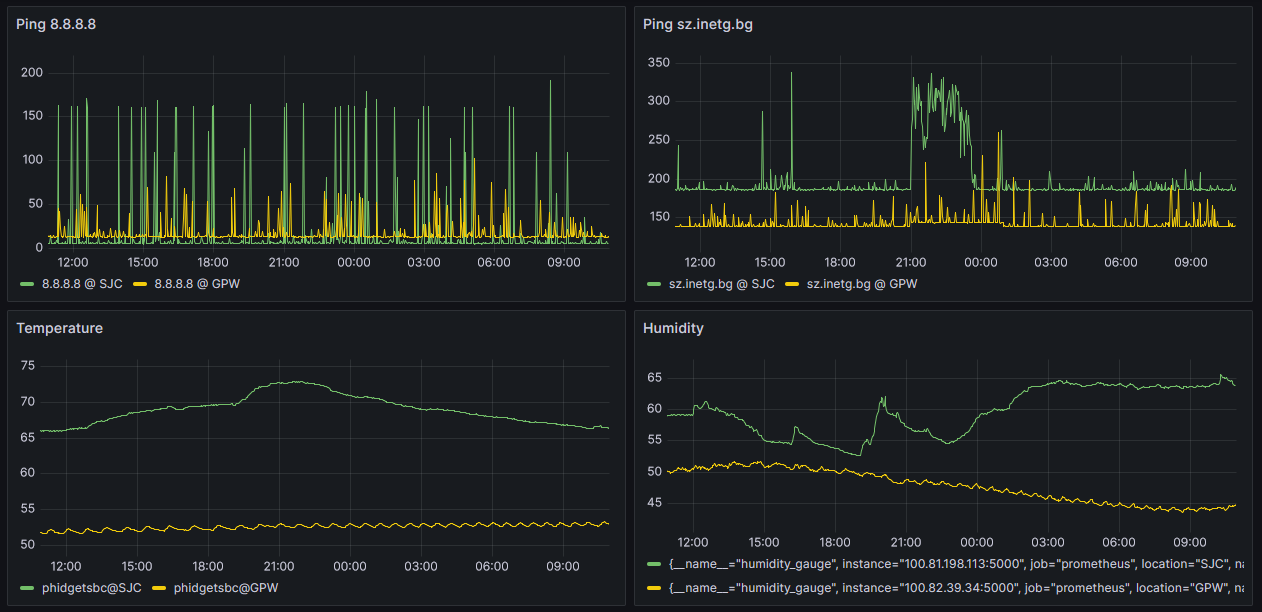
Our home Grafana dashboards are wonderful - we are monitoring ping latency to hosts we care about, as well as humidity and temperature.
The ping latency graphs are difficult to parse at a glance, however. There is too much noise, which obfuscates the meaningful information we need.
Here is the basic prometheus query and the resulting noisy ping latency:
ping_gauge{destination="8.8.8.8"}
Using the idea from Quick tip: How Prometheus can make visualizing noisy data easier | Grafana Labs we are going to apply quantile_over_time to de-noise.
Here is the new prom query and the resulting “smooth” grafana dashboards:
quantile_over_time(0.5, ping_gauge{destination="8.8.8.8"}[1h])
which then results in much smoother and easier to grok-at-a-glance (ping) graphs:
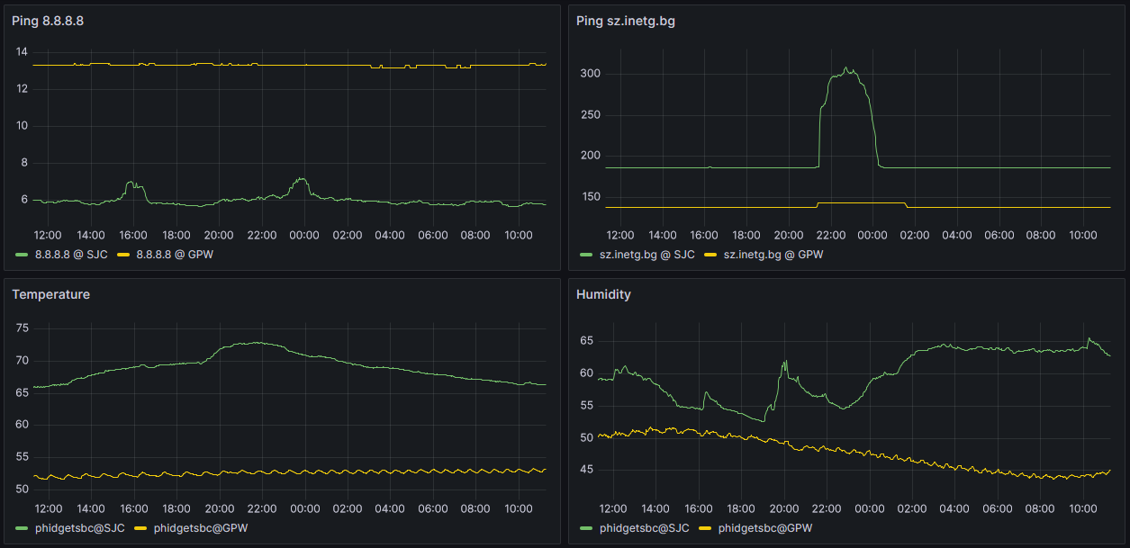
Conclusion
Applying quantile_over_time to fairly noisy data such as ping_gauge (latency time series data) we were able to remove noise, and smooth the data to a point where large-scale events become obvious. Now we can confidently ask the question: What happen to the Internet connectivity between continental US (California & Michigan) and Bulgaria from 9:45pm until midnight Eastern time zone.